
We worked with an outside designer to look at new designs that evolved from our current one. With the rebranding of the FJMC, we felt we needed a logo that communicates a broader invitation and the four pillars—Friendship, Judaism, Mentorship, Community—with a more modern, inclusive, and emotionally resonant feel. The new design signals our evolution from a “Federation” to “FJMC International” to better represent our global reach and modern vision.
These guidelines are designed to help us present a consistent and recognizable identity across every touchpoint. By using our brand thoughtfully and consistently, we reinforce the values that connect our members and help ensure that everyone who encounters our organization experiences the same welcoming sense of purpose and community.
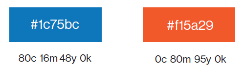
The new logo includes specific fonts, colors, sizes and positions.
If you need a different file type or have a question concerning usage
please contact .
YES! Place on a high-contrast background for legibility
YES! Use clear space around logo
NO! Don’t stretch, rotate, or change colors
NO! Don’t alter typography with outlines, shadows, etc.
Right-Click logos to download
PRIMARY LOGO – PNG | SECONDARY LOGO – PNG |
PRIMARY LOGO – JPG | SECONDARY LOGO – JPG |
Right-Click logos to download
PRIMARY LOGO – PNG | SECONDARY LOGO – PNG |
PRIMARY LOGO – JPG | SECONDARY LOGO – JPG |
Need technical or website help? Email us at
Copyright © 2026 FJMC International. All rights reserved. Website designed by Addicott Web. | Privacy Policy